The post Writers, Take Note! The Power Of Infographic Comparison In Your Blog Posts appeared first on Ostmosis Labs.
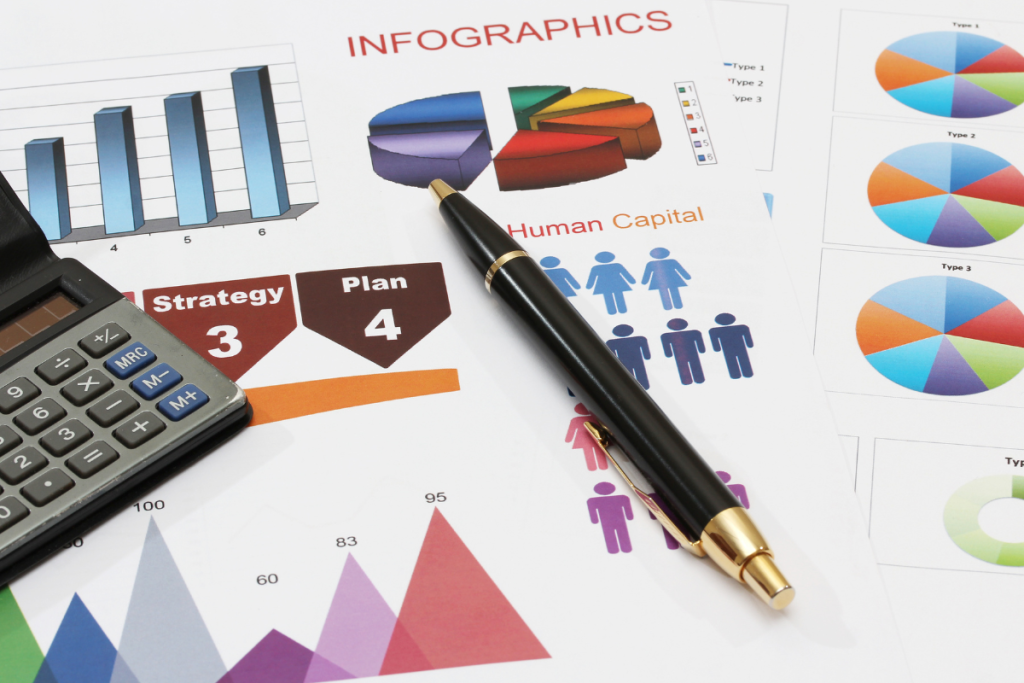
]]>An infographic comparison is quite simply an infographic designed to showcase the similarities or differences between two or more elements. Using visuals such as charts, graphs, or illustrations, infographic comparisons can make complex information and data easier to digest and more enjoyable to consume.
In this blog post, we’ll explore the power of infographic comparisons in blog posts and see how they can enhance your storytelling capabilities and make your content more engaging.
Infographic Comparison – An Overview
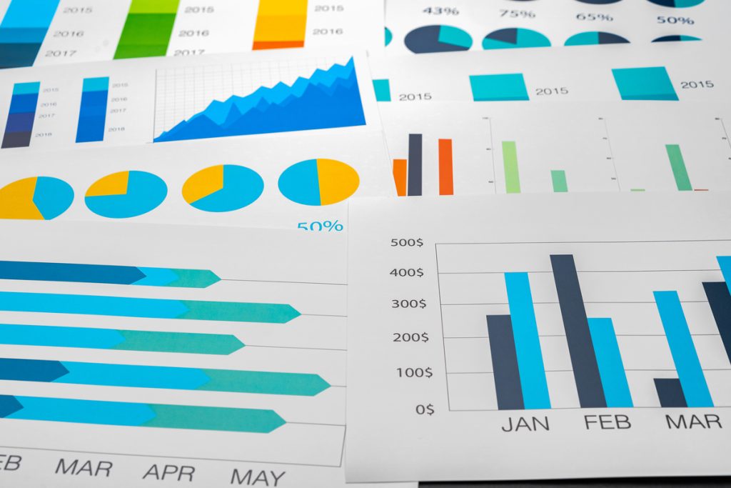
Infographics turn numbers into narratives and facts into visual stories. Essentially a graphic visual representation of information, infographic design aims to make data easily understandable through icons, diagrams, and compelling visuals. Key to the arsenal is the comparison infographic—a format that pits data side-by-side to visualize the pros and cons, similarities, and disparities in an instant.
The variety of templates, like the comparison infographic, ensures there’s a match for every narrative. From flowcharts depicting processes to comparison charts that put products or ideas head to head, these visual tools capture attention and aid retention.
Types of Infographics:
- Comparison Infographics: Perfect for weighing differing concepts or products.
- Statistical Infographics: Ideal for showcasing survey data or important statistics.
- Timeline Infographics: Useful to trace the history or the development of an event or product.
- Process Infographics: Simplify complex procedures into step-by-step visuals.
Infographics have journeyed from cave paintings to Egyptian hieroglyphs to become the sleek digital tools we know today. In this evolution, comparison infographics especially have carved out a niche for efficiently breaking down complex decisions and discussions into crystal-clear graphics.
Whether through a free comparison infographic template or a full-customized design, infographics reshaped how we digest information.
Integrating Infographics Into Your Writing
Imagine captivating your readers with visually appealing, data-driven narratives right within your blog posts. Using comparison infographics will engage your audience, convey complex information, and simplify decision-making. Let’s explore how to integrate these eye-catching visuals into your writing effectively.
- Identify the right opportunity: Spot the moments when a free comparison infographic template can illuminate similarities and differences or the pros and cons. Use them for product comparisons, pricing breakdowns, or contrasting ideas.
- Choose a template: Explore customizable options in free downloads of templates tailored to your needs. From side-by-side comparisons to bar charts or Venn diagrams, find the ideal design for your data visualization.
- Tell a story: Your infographic should have a narrative. Craft a compelling, easy-to-understand visual representation of the information that encourages readers to make informed decisions.
- Seamlessly incorporate: Once you’ve created your infographic using a template or an online infographic maker, embed it into your blog post, ensuring that it complements your text and contributes to the clarity of your message.
- Share on social media platforms: Propel the reach of your content by showcasing the infographics separately on social media channels, driving engagement and interest back to your blog post.
Effective data visualization is fundamental to the success of your comparison infographic. Ostmosis Labs offers stunning, customizable infographic templates and design elements aimed at achieving visual clarity and impact. Bolster your blog posts and marketing materials with comparison infographics—help your readers visualize the information and make those key decisions.
Comparative Infographics – A Unique Approach
Comparative infographics differentiate themselves with their unparalleled ability to visualize the pros and cons, similarities, and differences between two or more items through visually engaging graphics and diagrams. They bring unique value by presenting contradictory or supporting data in a way that’s easy to understand and compare.
Leveraging the power of comparison infographics involves prioritizing the crucial elements in your design:
- Choose the right format: Employ the appropriate comparison infographic template to showcase your information. This includes side-by-side designs, Venn diagrams, or bar charts to exhibit essential contrasts.
- Clarity and visual hierarchy: Ensure that your infographic design offers a comprehensible and logical flow of information. Structure the elements to guide your reader’s attention through meaningful insights.
- Be concise and focused: Avoid overwhelming your audience with excessive detail. Instead, distill your data points into icons, graphs, and short text elements.
- Appealing visuals: Capture your readers’ attention with a visually striking design that complements your content and emphasizes significant takeaways.
- Consistent branding: Align your comparative infographics with your brand’s identity. Utilize specific color schemes, fonts, and icons that resonate with your target audience.
Following these tips will create compelling comparative infographics, elevating your content and enhancing your audience’s understanding. Take in the transformative power of these visually rich tools to strengthen your writing, hold your readers’ attention, and promote in-depth comprehension.

Tools To Create Powerful Infographics
Empower your blog with riveting infographics by leveraging these easy-to-use, versatile online infographic makers:
- Venngage: User-friendly and feature-rich, Venngage boasts various free comparison infographic templates, perfect for product comparisons or pricing breakdowns. Design easily using editable elements, customizable color schemes, and stock photos.
- Infogram: Suitable for creating bar charts or comparing data points, Infogram simplifies data visualization with a drag-and-drop interface, multiple options to visualize information, and customizable design elements for that perfect infographic example.
- Adobe Creative Cloud Express: Ideal for comparing two products side by side, Adobe’s tool offers a range of editable infographic templates with a focus on visual clarity and precision. Choose from different layouts and incorporate engaging design elements for a polished infographic.
- Visme: With vibrant color schemes and a wide array of free customizable templates, Visme covers all your infographic needs. You’ll create stunning visuals swiftly from comparison infographics that provide clear visual advantages to product comparison charts.
- Canva: Access an extensive collection of premade templates for comparing similarities and differences between two or more items. With Canva, creating an eye-catching infographic is as simple as customizing the design and sharing it on social media platforms.
Get into infographic creation with these top tools designed for every need. Streamline data visualization to captivate your audience while equipping them with the knowledge they need to make informed decisions. Stand out from the crowd in no time with the right mix of design prowess and industry-leading infographic makers.
Challenges In Using Infographics And How To Overcome Them
Crafting an impactful comparison infographic isn’t without its hiccups. From data overload to design dilemmas, writers face various challenges:
Common Pitfalls:
- Data Overwhelm: Visual clarity takes a hit when too many data points cram an infographic.
- Design Paralysis: With an array of comparison infographic templates available, choosing the best fit can stall progress.
- Visual Inconsistency: An infographic that strays from your brand’s aesthetic can confuse your audience.
Solutions To Soar Above:
- Simplify: Less is more. Use icons and graphs to convey the pros and cons without clutter.
- Focus: Don’t get lost in the free comparison infographic templates buffet. Decide the story you want to tell and choose a format that best conveys that narrative, be it a comparison chart, bar chart, or diagram.
- Brand Harmony: Ensure the infographic design speaks your visual language. Consistent use of colors, fonts, and logos fortifies brand identity.

Comparison infographics are a mighty quill in a writer’s quiver. They break down complexities, compare critical insights side by side, and, above all, make information easier to digest. Embrace this visual storytelling format to kindle imagination, hold interest, and poise your blog post for engagement peaks. Propel your readers towards informed decisions—let infographics light the way.
The post Writers, Take Note! The Power Of Infographic Comparison In Your Blog Posts appeared first on Ostmosis Labs.
]]>The post Maximizing Website Conversion With The Right Infographic Strategies For Real Estate Professional appeared first on Ostmosis Labs.
]]>In real estate, catching a client’s eye is everything. Professionals must find innovative ways to stand out. One proven strategy to drive engagement and increase website conversion is the use of real estate infographics.
Infographics are not just pretty pictures, but powerful tools that can turn a casual website visitor into a potential buyer. These visual gems can simplify complex data, highlight market trends, and showcase properties in a way that words alone cannot.
In this article, we reveal the top infographic strategies that real estate professionals can use to make their websites irresistible conversion machines.
Get ready to discover how robust real estate infographic strategies can transform your home buying, selling, and marketing experiences!

Infographics For Real Estate – Why It Matters
To truly maximize website conversion, real estate professionals must grasp the power of infographics. So, let’s decode what they are, why they matter, and how they can be tailored for the real estate market.
What are infographics?
Infographics are visually appealing representations of data, information, or knowledge that simplify complex concepts into digestible, shareable content.
Why infographics? – Importance and significance in content marketing
Content marketing thrives when it captivates its target audience. Infographics play a pivotal role in:
- Grabbing attention with eye-catching visuals.
- Breaking down complex data into straightforward, digestible bites.
- Stimulating mental imagery that sparks interest and retention.
- Enhancing shareability—infographics are shared three times more than other content types.
Real Estate Infographics: A closer view
Real estate infographics are data-driven visuals designed specifically for the real estate market, covering topics like home buying, selling, mortgage rates, and market trends.
Role of infographics in real estate
Infographics help real estate agents, realtors, and brokers by:
- Simplifying market data: Buying or selling a home can be intimidating, especially with the plethora of data to absorb. Infographics make this information more accessible.
- Showcasing expertise: Well-crafted infographics amplify credibility, positioning agents and brokers as trusted authorities.
- Standing out: Custom real estate infographics set your content apart from the competition, making your website more memorable.
- Enhancing engagement: Infographics are ideal for engaging various segments of the real estate market, including buyers, sellers, and investors.
Advantages of using infographics in real estate
The benefits of real estate infographics are immense:
- Improved brand reach—Increased shares on social media generate greater awareness.
- Enhanced website traffic—Attention-grabbing content attracts visitors to your site.
- Higher conversion rates—Infographics help sway prospects toward making a decision.
- Richer content mix—Visuals enrich your website’s content, offering various formats for different audience preferences.
Infographics As A Tool For Website Conversions
The art of conversion is intrinsically tied to making complicated ideas simple and visual. Infographics is a heavyweight player in the digital marketing ring. In the world of real estate, they act as a grid that simplifies the intricate network of buying and selling a home.

The Correlation
Infographics can significantly improve your business by sparking your audience’s willingness to read content. They simplify complex market trends and housing data into easily digestible, bite-sized nuggets of information. This makes the home buying or selling processes more understandable, stirring first-time home buyers or homeowners on the fence about selling to action.
In-depth understanding of how infographics help in website conversion
The power of data visualization cannot be underestimated, especially in the real estate industry. When crafted expertly, an infographic template can illuminate valuable insights in ways that words can’t, turning potential leads into committed clients. By making information accessible and engaging, infographics retain relevancy regardless of market shifts or even a pandemic.
Many real estate professionals have utilized infographics to propel their marketing efforts and cement their status as thought leaders. For instance, the National Association of Realtors (NAR) often uses data-driven infographics to share insights on topics like market dynamics, buying patterns, closing costs, household energy efficiency, and more.
Components of a Compelling Real Estate Infographic
Ultimately, the success of a real estate infographic hinges on a few core elements:
- Clear content outline: Start with a concise message that serves your audience. What information do potential buyers and sellers need to know?
- Purposeful design: Visuals should enhance the message, not confuse it. Avoid clutter and ensure a layout that guides the reader’s eye through the content.
- Engaging graphics: They should clarify data points and patterns rather than just being aesthetically pleasing.
- SEO integration: Infographics need to be findable. Infuse SEO into your file names, descriptions, and text overlays to boost search engine visibility.
A well-executed infographic can make a massive difference in conversion rates. Bank on the visual power of infographics, and watch your website transform into an engaging, informative beacon attracting real estate buyers and sellers alike.
Strategies To Maximize Website Conversion Using Infographics
Successfully leveraging infographics to maximize conversions in the real estate market involves a few key strategies. Here’s how to give your website the upper hand.
Use of Local Area Data
Incorporating local area data into your real estate infographics fosters trust and engagement among potential buyers and sellers. Infographics that map neighborhoods, school districts, or nearby amenities offer valuable insights that could prove deal-sealers.
Showcasing Property Features
Using real estate infographics to highlight property features creates a layer of excitement for your listings. Consider a template visually presenting the floor plan, property history, or even before-and-after renovation images. These serve as powerful tools for the seller and help potential buyers envision themselves in the space.
Explaining the Buying Process
A daunting home-buying process can lead buyers to flee—bumping up your website’s bounce rate. Simplify it using infographics. A step-by-step visual guide outlining the journey from loan pre-approval to closing can ease anxiety and keep potential buyers engaged.
Infographics for SEO
Finally, including SEO tactics into your infographic creation process is essential. Use keyword-optimized file names, descriptions, and captions. This strategic move will attract viewers to your website and improve search engine rankings.
When housed on the website of a savvy real estate agent, broker, or realtor®, infographics wield significant power. They simplify, engage, and convert—all while increasing the visibility of your real estate business in the saturated online marketplace.
Tools And Platforms For Creating Real Estate Infographics
Creating eye-catching real estate infographics isn’t as complex as you might think. Various user-friendly tools exist to make real estate professionals feel like accomplished graphic designers.
Various Infographic Design Tools
Numerous online tools like Canva, Venngage, and others provide the resources designed to help even the most novice user create infographic templates. Canva, for instance, excels in user-friendly design and a wide selection of graphics, but it could be overwhelming for a first-timer. Whereas Venngage stands out with its industry-specific templates, it might lack variety in free design elements. Evaluate each tool, considering its pros, cons, and your specific requirements.

Utilization of Real Estate Infographic Templates
Ready-to-use real estate infographic templates can exponentially reduce design time and help maintain branding consistency. They can transform market trends or home-buying process information into compelling digital marketing materials.
Real estate infographics are fundamental marketing tools to handle the intricacies of the real estate industry, whether you’re buying or selling. They simplify complex information, support SEO efforts, and improve your business’s online visibility.
Empowered with these strategies and powerful tools like Canva and Venngage, creating infographics that share insights, complex data, and more becomes a breeze. By integrating infographics into your marketing strategies, you are set to fully leverage these graphic designs for your real estate company’s benefit. Steadily, you’ll increase audience engagement, build trust with buyers and sellers, and ultimately convert leads into clients, even in this pandemic era.
So, go on and embark on your infographic journey! Be prepared to see more interested clients, better conversions, and exponential growth in your real estate business.
The post Maximizing Website Conversion With The Right Infographic Strategies For Real Estate Professional appeared first on Ostmosis Labs.
]]>Every step is crucial in this process; this includes determining the pixels wide for readability, deciding the aspect ratio to match the platform requirements, and using an infographic to craft your design.
The post How To Select The Proper Infographic Dimensions for Your Project appeared first on Ostmosis Labs.
]]>Every step is crucial in this process; this includes determining the pixels wide for readability, deciding the aspect ratio to match the platform requirements, and using an infographic to craft your design. A well-sized infographic can catch the right eye, hold the reader’s attention, make them scroll down, and exactly meet LinkedIn or other platform’s size guidelines.
So, how can you create an infographic with the correct size and make it work for your SEO? This guide discusses how to select the proper infographic dimensions for your project, ensuring your graphic design is visually pleasing and aptly structured for your target audience.
Infographics – Understanding The Basics
When venturing into the domain of infographics, you’re quickly faced with understanding infographic dimensions. Those pixels wide and high potently influence how your audience interacts with your infographic, impacting everything from user experience to content marketing and SEO success. The select infographic templates from an infographic maker are more than a simple design choice: they shape the foundations of your graphic design.
Infographic Dimensions: What Does It Mean?
When we discuss infographic dimensions, we’re essentially addressing the width and the height of the infographic. These analytics impact the following attributes:
- Width (‘Pixels Wide’): The horizontal measurement of your infographic. Critical to adhere to the specific browser or platform (like LinkedIn) parameters, ensuring the infographic fits within the specific viewing pane without needing horizontal scrolling. Balancing width maintains the aesthetics of the infographic.
- Height: The vertical measurement of your infographic determines how much data you can incorporate and how far a viewer needs to scroll to capture all the content. Crafting an infographic that encapsulates critical information without imposing infinite scrolling is key to keeping hold of your audience’s attention.

The Significance Of Size In Infographics
Apart from design and content, the sizing of your infographic is a pivotal element. Here’s why:
- Readability: Small infographics may require your audience to strain their eyes or zoom in to consume the content—sizing matters in retaining interest.
- Aspect Ratio: The proportional relationship between the width and height of your infographic, the aspect ratio, is critical to maintaining and ensuring a rhythm to your infographic to encourage smooth scrolling.
- SEO performance: The appropriately sized infographic can assist with SEO performance, helping pages load more quickly and paving the path to content marketing success.
- Platform compliance: When planning to post your infographic on platforms like LinkedIn, you should consider the platform’s infographic size requirements. For example, LinkedIn’s recommended image post size is 1200 x 675 pixels.
Selecting The Ideal Dimension: Crucial Considerations
While infographic dimensions may vary significantly based on content or platforms, some considerations should guide your decision:
- Audience: Gauge the behavior patterns of your target audience. Would they indulge in a longer infographic with detailed information, or would they connect with a concise and clear infographic better?
- Content: If your content is dense and requires visual elaboration, plan for a higher infographic, but balance it with a corresponding width for visual balance.
- Platform: The destination for your infographic, be it web pages, LinkedIn, or Instagram, each platform has unique size requirements.
Understanding the basic principles of sizing in infographics provides a sturdy foundation for creating compelling infographics. As you move forward, refinement in the art of selecting the right infographic dimensions will aid you in concocting infographics with greater impact. Stay tuned to learn more about the methods and tools that can help you determine the best infographic dimensions for your project!
Criteria For Selecting Infographic Dimensions
The right infographic dimensions are essential for great visual impact. Your ultimate guide to making a lasting impression boils down to selecting the perfect dimensions for your content. Here, we’ll cover the fundamental criteria to consider.
I. Platform Specifications
Different platforms offer different optimal dimensions for infographics. For instance, the best infographic size for Facebook is an image with dimensions 1200 px wide and 630 px tall. Having a cheat sheet for each platform can be a powerful tool. A site like Canva offers default-size options for common platforms, making the process of helping your infographic fit the right social media platforms a breeze.
II. Content Volume and Complexity
The content volume and complexity play a significant role in defining the right infographic size. A long infographic might be appropriate for presenting complex information, but consider segmenting infographics if the information gets overwhelming. The standard size might not fit all types of infographics. Design your infographic as a single image or a gif if the content demands it. Remember, you have to balance information density with ease of viewing.
III. Audience Devices
Audience devices greatly influence the size and dimensions. Knowing where your infographic is going to be viewed can help tailor the optimal size. A vertical infographic might work best if your audience is predominantly mobile users. Use a single image for quick loading speed and ensure higher resolution for larger screens.
IV. Ease of Viewing
Aim for 600 pixels wide for websites and blogs, ensuring your infographic looks great without forcing horizontal scrolling and an infographic height that doesn’t exceed 1800 pixels for a comfortable scroll length.
When selecting dimensions, balancing the content’s purpose and audience comfort cannot be underestimated. Size plays a crucial role in infographic design. Make sure your infographic fits comfortably in the view of your audience, is easy to understand, and looks visually appealing.
Testing and experimentation are your best friends when it comes to infographics. Try out different sizes, design elements, and types of infographics, and always adapt based on what works best for your specific projects. Use the recommended sizes as a starting point, but always adapt based on your content needs and the platform you’re sharing on.
Check out the Ostmosis Labs blog for the different types of infographics and how to make sure they look great on different platforms. Whether it’s a PNG, JPEG, or GIF, we’ve got you covered! From creating infographics based on a Canva template to designing an infographic from scratch today, you’ll get the know-how for an impactful and immersive infographic experience.
Using visuals to help present complex information quickly and clearly is an essential part of infographic creation. Maintaining image quality while keeping the file size manageable for downloading the infographic or sharing on LinkedIn rounds out this informative guide.

Remember, infographics are a powerful tool in your marketing repertoire. Start designing your optimal infographic and create a visually appealing narrative that fits the platform and meets your audience’s expectations. Infographics don’t just present data; they tell stories. Let yours begin!
The post How To Select The Proper Infographic Dimensions for Your Project appeared first on Ostmosis Labs.
]]>The post How Professionals And SMEs Can Benefit From An Infographic Roadmap appeared first on Ostmosis Labs.
]]>The templates suit various formats and are easy to use, enhancing your presentations. Roadmap infographics help distill complex timelines into digestible graphics, transforming them into influential visual marketing tools.
So, these infographic roadmaps can be instrumental whether your target is creating a robust marketing image or simplifying a multiplex project timeline to a colorful diagram. This article showcases the key advantages of integrating roadmap infographics into your strategic planning process.
Infographic Roadmap Benefits: Simplifying Complex Information
An infographic roadmap is a graphically designed representation of data, ideas, or step-by-step processes. It combines visual elements with small bursts of textual information to create an engaging and easy-to-understand summary of a specific content sphere.
When confronted with heavy loads of information and undefined paths, an infographic roadmap provides a colorful, easy-to-digest, visual solution. You no longer need to sift through piles of dense reports when you can glance at a single, well-crafted image.

Consider these benefits:
- Distillation: Infographic roadmaps effectively distill problematic data, guiding you effortlessly from point A to point B along clearly identified steps, creating a streamlined path to your destination.
- Customization: With various formats, styles, and color palettes, these templates can be tailored to match your brand or specific project.
- Ease of Presentation: Create visual impact with your marketing strategies effortlessly with our PowerPoint slides. Its marketing is made easy and efficient.
- Wider Audience Reach: Since infographic roadmaps enhance information accessibility, they enable you to reach a wider audience who may not be familiar with industry jargon or complex data sets.
Remember, a roadmap infographic isn’t just a visual delight. It’s a powerful tool that brings ease to understanding your business processes, systems, projects, or marketing journeys. And when information is easy to understand, it’s simple to take action.
Check out Ostmosis Labs, where we meticulously design infographic roadmap templates to ensure ease of navigation. Every step, every slide, tells your story precisely. Each timeline, chart, and diagram minimizes complexity, converting dense data into meaningful, visually appealing content.
Utilize Infographics For Better Project Management
The multi-step, timeline-based structure of a roadmap is ideal for project planning. Teams can visualize the whole process, depict dependencies, and identify potential bottlenecks, making the planning process more transparent and efficient.
A roadmap infographic template elegantly incorporates appealing icons, stages, and vectors to represent the various tasks on a project’s timeline. Here’s how this visually stunning tool contributes to efficient project management:
1. Visualizing Key Tactics
A project is essentially a path to a specific goal. A roadmap infographic is a visual representation of this path, aligning team members by displaying critical tasks, milestones, and deadlines in a way that’s easy to grasp. It’s essentially effective communication via a vibrant, editable layout.
2. Effortless Product Launches
Product roadmaps, a specific type of roadmap infographics, are perfect for planning and executing a product’s journey from conception to launch. Ideal for aligning your team and presenting to stakeholders, these infographics use appealing visuals to represent each task, stage, and even potential roadblocks.
3. Keeping Departments Aligned
Whether you’re planning a customer journey or creating a file of quarterly objectives, roadmap infographics offer a customizable graphical analysis and overview of the project. These editable diagrams, available for PowerPoint and Google Slides, serve as a guide to align the objectives of different departments within an organization.
4. Ease of Customization
Our roadmap infographic templates offer a flexible base that you can edit to suit your specific needs. They’re user-friendly, compatible with PowerPoint or Google Slides, and are a strategic way to stun your audience and get the show on the road!
A roadmap infographic isn’t just an appealing graphic. It’s a powerful tool that makes complex project management tasks understandable, visual, and—dare we say it— enjoyable! With professionally designed roadmap templates, you are provided with invaluable aid to achieve your project’s deliverables, one milestone at a time.

Enhancing Stakeholder Communication
The adage “Communication is key” rings especially true in the dynamic business arena. This becomes even more crucial when it involves a company and its stakeholders. A bridge of understanding between the company’s vision, goals, tactics, and the stakeholders’ interests is built with clear, concise communication.
Here’s how a roadmap infographic facilitates effective communication with stakeholders:
- Simplicity: Roadmap infographics turn complex data and timelines into a colorful, digestible visual, making it easier for stakeholders to grasp your strategies.
- Clarity: Every stage of your project, every step towards your goal, is laid out visually on a roadmap, eliminating ambiguity and enhancing transparency.
- Engagement: No one enjoys sieving through dense reports. A colorful, interactive infographic comes as a breath of fresh air, boosting engagement with the audience.
- Customization: Our templates cater to all styles and aesthetics. Our roadmaps can be tailored to match your previous communications’ tone, style, color, and format, ensuring brand consistency.
- Versatility: Whether it’s a PowerPoint slide for a shareholder meeting or a timeline chart for your project, these ready-to-download infographic roadmaps can be adapted to suit all requirements.
So whether you’re a small marketing firm or a large corporation, our editable, downloadable roadmap templates are your answer to enhance stakeholder communication. Ditch the bland charts and monotonous presentations. Infuse life and color into your messages with interactive and visually appealing infographic roadmaps.
Fostering Collaboration
In a team environment, collaboration is the linchpin that binds individual skills and talents into a well-oiled, effective machine. Without it, tasks may become misaligned and goals blurred. One of the effective means to establish strong collaboration among team members is through a clearly laid out, visually appealing roadmap infographic.
A roadmap infographic cores through the bedrock of complexity and ambiguity, providing a clear and concise design that spells out every task, every step, and every goal.
A roadmap infographic articulates the entire project on a single canvas—the goals, tasks, and timelines—ensuring every team member shares the same understanding and vision. Roadmaps clearly delineate responsibilities, tasks, and timelines using visual cues, making it easy for team members to understand their roles within the larger project schema.
A visually stimulating infographic is more likely to engage your team than mundane text-based formats, leading to better absorption of the project’s intricacies. A high degree of customization comes with our templates. Whether you need to adjust the color scheme, add slides, or change the format, everything can be tailored to suit the team’s preference.
Our roadmaps are available for download and viewable in PowerPoint, enhancing the ease of access and exposure to the project structure. Leverage the power of our roadmap infographic templates to foster impactful collaboration within your team.
Put complicated charts and drab presentations aside; stride forward with vibrant, insightful infographic roadmaps because clear paths lead to well-collaborated victories.
Time And Resource Optimization
Business is a race against time and resource constraints. Efficient management of both isn’t just a desirable skill; it’s a survival imperative. Roadmap infographics, more than just artistic layouts, come to the rescue when it comes to this crucial element of business.
Understanding the process and having a clear goal in sight is significant in the journey of product-making and customer service. Insightful infographic templates for PowerPoint and Google Slides, including the roadmap infographic template, make it easier for every team member to stay on point.
Take a look at why teams relish our vivid roadmap templates:
- Action Plan Unfolded: Roadmap infographics are potent visual tools that provide clear-cut directions. They visualize your project’s tasks, stages, and milestones step-by-step, ensuring nobody gets lost in the weeds.
- Time Savers: Professionally designed to perfection, these Google Slides and PowerPoint-ready templates save hours that would otherwise be spent creating a roadmap from scratch.
- Resource Allocation: With tasks and objectives laid out visually, allocating resources optimally is easier, mitigating the risk of misusing vital assets.
- Adjustable to Evolving Needs: Offer a high degree of customization; these infographic templates can be edited further down the line as your goals evolve. Your product roadmap infographic is a living document that charts your course of action.
Effective time and resource management isn’t a luxury reserved for the few – it’s well within your reach. Make the smart move towards optimization – bring clarity, prevent wastage, and steer your team towards a well-defined goal with roadmap infographics. You’ll be glad you did!
Facilitates Decision-Making
Swift, informed decision-making serves as a lifeblood for SMEs’ success. This agility often marks the thin line between growth and stagnation. Roadmap infographics dive headfirst into this arena, arming you with a tool that promotes proactive decision-making.
A roadmap infographic visually represents a project’s lifecycle—or product’s journey—which is more than just a design. It’s a decision-making compass. Here’s how infographic roadmaps augment the decision-making process:
- Visual Clarity: The visual format of a roadmap infographic makes it quicker for the brain to process information, speeding up decision-making.
- Holistic View: With a roadmap infographic, the entire project’s timeline, from inception to conclusion, is in plain sight. This broad overview enables you to make well-informed and timely decisions.
- Track and Adjust: Roadmaps allow you to monitor progress and swiftly make necessary changes. Whether it’s adjusting timelines or reallocating resources, the information is right there at your fingertips.
Roadmap infographics are indisputably powerful allies for any professional or SME. The advantages of adding this potent tool to your arsenal are numerous, from enhanced stakeholder communication, fostering collaboration, and optimizing time and resources to facilitating decision-making.
Infographic roadmaps are an effective, efficient, and engaging tool for professionals and SMEs. By transforming complex datasets into visually recognizable patterns, this tool supports decision-making processes, boosts engagement, and strengthens brand awareness – significantly contributing to the growth and success of individuals and business entities alike.
The post How Professionals And SMEs Can Benefit From An Infographic Roadmap appeared first on Ostmosis Labs.
]]>The post Benefits Of Infographics For Professionals: Lawyers, Doctors & Architects appeared first on Ostmosis Labs.
]]>This makes it a powerful resource, especially for professionals such as lawyers, doctors, and architects. Below, we dive into the benefits of infographics for these professionals.
How Infographics Simplify Complex Information
Infographics not only simplify complex information but also make it captivating. Professionals like lawyers, doctors, and architects can harness the potential of infographics for improved communication, education, and marketing. The success of an infographic lies in its ability to be both informative and engaging – a balance that, when achieved, can greatly help professionals in their respective fields.
Let’s look deeper into how each of these professionals can specifically use compelling infographics to distill intricate data:
A. Lawyers — Illustrate Legal Processes, Timelines, and Laws
Legal terms and proceedings can be difficult to understand for clients and the general public. An infographic can break down these concepts into easily digestible visuals and content. This promotes a better understanding of rights, obligations, timing, and procedures.
Lawyers can use infographics to:
- Depict the timeline of a case, highlighting significant events.
- Break down laws and legal jargon for clients.
- Illustrate the legal processes of courtroom proceedings.
This approach appeals not only to the clients seeking counsel but also helps increase shareability, ultimately improving SEO and brand awareness.
Infographics are excellent tools for law firm marketing as they are more likely to be shared than text-based content. They can improve website traffic, social media engagement, and client conversion rates.
B. Doctors — Simplify Medical Procedures, Diagnoses, and Treatment Plans
For doctors, infographics can help communicate complex medical conditions, procedures, and treatment options to patients. A detailed infographic can do a far better job of explaining these complexities than mere words, thereby promoting patient comprehension and adherence to treatment procedures.
Doctors can employ infographics to:
- Explain various diseases, symptoms, and risk factors in a digestible manner.
- Visually present different treatment options and their benefits.
- Illustrate medical procedures to alleviate patient anxiety.
Infographics can also be used for public health campaigns to quickly disseminate vital information to the public. They can efficiently communicate on diverse topics like vaccination schedules, chronic disease management, and health statistics.
Medical researchers can use infographics to present a summary of their research findings. This aids in increasing the accessibility and ease of understanding of the research.
By distilling complex medical information into an easy-to-understand format, infographics arm doctors with an effective communication tool while enhancing their content marketing strategy.
C. Architects — Present Design Projects and Architectural Concepts
Infographics help architects to visualize designs, building layouts, and structural plans more effectively. They can greatly aid in illustrating design concepts or architectural details to clients or construction teams.
Architectural projects encompass multiple layers of detailed information, which can lead to a cumbersome understanding. Infographics offer architects the opportunity to streamline this data by:
- Outlining the crucial details of a design project in a visually appealing way.
- Demonstrating architectural concepts, making them approachable for clients.
- Showcasing the correlation between multiple project components.
Infographics can detail project timelines, phases, and processes in a simple, easy-to-understand manner. This can further streamline communications and ensure all involved parties are on the same page. Architects can also use infographics as a creative tool to showcase their portfolio and past projects. This helps create a visual impact and memorable impressions on potential clientele.
Incorporating infographics into architectural presentations can foster client understanding and amplify the project’s visual aspect, ultimately improving search engine rankings and overall brand visibility.
Infographics have the unique ability to simplify complex information across various professions. Their visually appealing and shareable nature can massively enhance content marketing, SEO, and brand awareness. As lawyers, doctors, and architects continue to recognize and harness the benefits of using infographics, they can elevate their communication strategies and resonate with their audience more effectively.
Infographic Benefits — Enhance Retention and Engagement
The goal is clear for legal professionals, but dense legal documents often shroud the pathway. However, infographics are an excellent method of conveying complex ideas in a way that’s easier to understand. In trials, a well-designed infographic can provide a powerful aid to jury comprehension.
They can illustrate key points using types of charts, such as a timeline infographic or a comparison infographic, ensuring the most critical information gets shared effectively. This digital age tool enhances attention and memory, making every infographic you create a competitive advantage in the courtroom.
Infographics offer a clear route to enhancing patient compliance and health education in healthcare. Citing an easy-to-understand infographic example efficiently explains the benefits of medication or the disadvantages of poor lifestyle choices.
A beautifully designed infographic explaining the benefits of medication compared to the complications of untreated conditions can significantly improve patient understanding and adherence. Infographics stand as pillars of health education, making information easily digestible in the digital world.
Architects operate within intricate design dimensions. For them, a simple, engaging infographic is a game-changer. Whether it’s a statistical infographic illustrating project dimensions or a geographic infographic mapping the project’s location, the process of elaborating complex blueprints becomes simplified. Infographics help foster stakeholder engagement, ensuring that everyone, from clients to contractors, understands the project’s key features.
Incorporating infographics into your strategy offers a wide range of benefits in the world of content marketing. Not only do they simplify information and aid memory, but they also drive user engagement and are easily shareable—gaining backlinks and boosting your website’s visibility in search engine results. A great infographic is one of the best ways to tell a story that resonates with your target audience.
Going the Extra Mile — Tips for Creating Effective Infographics
Now that we understand the benefits of infographics for professionals let’s discuss some tips that can help make your infographics more effective for your specific field.
1. Know Your Target Audience
Identify your target audience and their needs – whether it is clients, patients, colleagues, or the general public. This will help you determine the type of information most relevant to them and present it in a way that resonates well.
2. Keep it Simple
An effective infographic should be easily digestible with minimal jargon. Use straightforward language, break down complex concepts into simpler terms, and utilize many visual elements to tell a story.
3. Use Of Visual Hierarchy
Employ a visual hierarchy by presenting information in a structured manner. Highlight the most important aspects of the content and use design elements to guide the viewer’s attention to those key points.
4. Maintain Accuracy
Ensure you include accurate data, statistics, and facts, preferably backed by credible sources. This will strengthen your professionalism and reinforce the trust of your target audience in the presented information.
5. Use Relevant Icons, Images & Colors
Design elements like icons, images, and colors in an infographic should be meaningful and relevant to the content. For example, adding legal-themed icons for lawyers, medical-themed icons for doctors, and architectural-theme icons for architects can aid in better content comprehension and visualization.
6. Keep It Shareable
Create easily shareable infographics, either by embedding them on a website or sharing them on social media. This will increase your reach and help garner a larger audience.
7. Include Branding
Customize the infographic with your branding elements, such as logo, company colors, and fonts. This will enhance your professional image, promote brand recall, and create a sense of consistency across your marketing materials.
Infographics are invaluable for professionals looking to communicate complex information engagingly and memorably. By understanding the benefits and implementing effective design techniques, professionals like lawyers, doctors, and architects can create infographics that enhance comprehension, foster client engagement, and build their brand’s credibility.
The post Benefits Of Infographics For Professionals: Lawyers, Doctors & Architects appeared first on Ostmosis Labs.
]]>