

Taking advantage of visual content is more important than ever. Infographics are currently at the forefront of web design and development, blending valuable information with attractive visuals. Using infographic tools effectively can elevate your website design and development process to another level.
Infographics are a visual representation of information, data, or knowledge. They distill complex concepts into easily digestible, visually appealing elements. With the rising prominence of visual content, infographic tools have become integral in web design and development.
Different tools come with different functionalities and interfaces. Here are a few highly effective infographic tools you may consider:
- Canva: Canva is a versatile online tool that offers a range of templates, images, icons, and fonts. Its user-friendly interface is suitable for beginners.
- Venngage: A professional design tool, Venngage provides a large variety of infographic templates and custom designs to choose from.
- Piktochart: Piktochart offers a simple way to turn raw data into engaging infographics using templates and intuitive design tools.
Choose the tool that best suits your design needs, comfort level, and budget.

Why Are Infographic Tools Important?
Visuals help people understand information more efficiently and effectively. Infographics can break down complex information into digestible, easy-to-understand chunks, which may prove critical in promoting understanding of sophisticated services or products. Infographic tools play a pivotal role in web design and development for several reasons:
1. Enhanced User Engagement
A user’s digital journey can be a fleeting moment. Infographics serve as vital pause points that can arrest attention and engage curiosity. By creatively harnessing infographic design elements like icons, graphs, adobe aesthetics, or even movement through a drag-and-drop infographic maker, your content can transform from being just another piece of information to a visual delight that captivates and retains user interest. Infographics also make room for interactive elements, leading to even deeper user engagement.
2. Easy Absorption of Information
The charm of an infographic is in its ability to make complex data comprehensible at a glance. An effective infographic template strategically uses visual elements – colors, fonts, symbols, and spatial relationships to guide a user’s eye and simplify the understanding process.
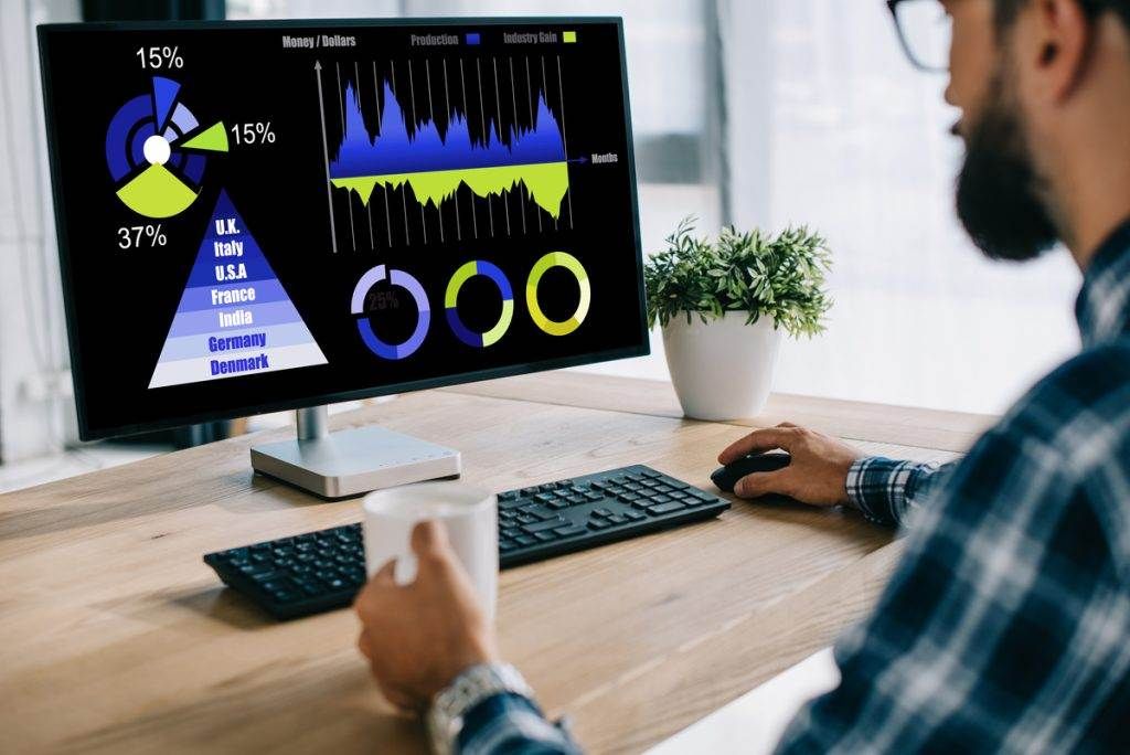
Whether it’s a pie chart illustrating fiscal shares or an icon-based timeline depicting historical events, infographics work because they align with our brain’s preference for visuals over text, aiding in quicker and easier information absorption.
3. Boost SEO
Infographics serve as powerful leverages in SEO. When well-designed infographics become the bedrock of valuable information on your page, they enhance the possibilities of organic linking from other websites and blogs, essentially boosting your inbound SEO strategy. Further, the strategic use of data visualization in your content signals search engines about the relevancy and quality of your information, ultimately contributing to a higher ranking on the search engine results page (SERP).
4. Shareability
Brace yourself for a hard-hitting digital truth – Infographics are extremely share-worthy. In their perfect blend of simplicity and complexity, infographics become an attractive parcel of ‘portable information’ that users love to share across social media channels and niche community platforms, thereby widening your outreach effortlessly.
Their use transcends sectors and demographics, making infographics universally appealing to a broad audience base.
Infographics are versatile, influential, and here to stay.
Optimizing Infographic Tools For Website Design & Development
Infographics are a game-changer, and optimizing the use of infographic tools can significantly enhance your website design and development. Once you’ve picked an infographic tool, it’s crucial to optimize its use:
1. Understanding Your Audience and Goals
Before creating an infographic, consider your audience’s needs and content goals. Visualize their demographics, interests, and browsing habits. The best infographic is tailored to its viewers.
- Know your Audience: Data-rich presentations might be preferable if you’re targeting a tech-savvy crowd. For a younger audience, a brighter, more graphics-oriented approach can hook their interest.
- Decide the Goal: Are you sharing a huge chunk of data, explaining a complex concept, or showcasing a process? Your objectives guide the infographic’s makeup.
2. Choosing the Right Infographic Tool
Selecting the right infographic maker is where your plan starts coming alive. Different infographic tools offer different templates, design options, and edges.
- Canva: It’s a user-friendly infographic maker with a range of free infographic templates that you can easily customize. Its drag-and-drop feature adds convenience to your creation process.
- Adobe Spark: It offers many professional-looking templates with top-notch graphic design capabilities.

3. Design for Clarity
For effective infographics, clarity is key. Your data must be well organized, your icons should suit the content, and the color scheme, font, and overall visual aesthetic should align seamlessly.
- Data Organization: Use graphs and charts to simplify and visualize complex data.
- Icon Selection: Choose clear, descriptive icons that complement the text and reinforce the message.
- Color & Font: Use contrasting colors for clarity and readability. Choose a font that’s aesthetic and easy to read — even from a distance.
4. Making Infographics Interactive
Interactivity breeds engagement, and making your infographics interactive can take your visitors’ experience up a notch. Use drag-and-drop features to embed interactive elements, like links to your blog or website.
Not only does this keep your audience engaged, but it also extends their stay on your site – a big win in the world of web development!
5. Incorporating SEO into Your Infographics
Search engine optimization (SEO) isn’t just for text. Use SEO strategies to help your infographic stand out in search results:
- Alt Text: Include keywords in your infographic’s alt Text.
- Caption: Incorporate keywords and phrases related to your infographic content.
- Filename: Name your infographic file (usually PNG) with the suitable keywords.
With these optimization strategies, creating infographics isn’t just an exercise in graphic design. It’s about crafting a unique, engaging, and effective narrative that aligns with your audience’s needs and your website’s goals.
Tools And Resources For Creating Infographics
Creating visually stunning and informative infographics can seem daunting without the right tools. However, several resources can make the process considerably easier, even if you’re not a professional designer. Below are some of the top tools and resources you can leverage to create compelling infographics:
- Canva: Known for its user-friendly drag-and-drop interface, Canva is deemed the go-to platform to create infographics. It offers plenty of infographic templates, intuitive customization options, and a library of icons and fonts, rendering it a remarkable tool in the marketplace.
- Adobe Creative Cloud: Adobe caters primarily to those with an inclination toward advanced graphic design. Despite presenting a learning curve, its Illustrator and Photoshop tools furnish extensive infographic design options and provide the ability to work with different plans and export in PNG format.
- Visme: An effective infographic maker, Visme makes it simple to visualize complex data. It offers various customizable templates and creates engaging interactive infographics with data editing features, making your data visualization journey smooth.
- Piktochart: Piktochart is an excellent mix of quality templates and user-friendliness. Handy customization and a seamless drag-and-drop feature make it easy for both novices and experienced designers to create an infographic.
- Infogram: Infogram distinguishes itself with its robust data visualization tools. Whether you’re looking to create basic graphs or detailed infographics, Infogram can aid in transforming data into readable, impactful visuals.
Ensuring Accessible Infographic Templates
Making your infographics accessible is crucial in reaching a larger audience, especially those with different accessibility needs. By focusing on accessible infographics, you will create an inclusive experience for users who may have visual, cognitive, or motor impairments.
Consider the following tips to ensure your infographics cater to these requirements:
- Alt Text: Providing alt text for your infographic allows screen readers to describe the visual content to blind users or those with impaired vision. For instance, alt text for a timeline infographic should describe the key dates and events in chronological order.
- Transcripts/Captions: If you choose to make infographics that include audio or a video infographic, transcripts or closed captions enhance accessibility for users with hearing impairments. Tools like Adobe Creative Cloud come with features that help you create these assets.
- Logical Layout and Easy Navigation: Infographics should be logically designed to enable easy navigation for users with cognitive disabilities. This involves ensuring a clear flow of information by using clear labels and signs that guide users through data points. Online infographic makers have drag-and-drop editors that streamline this process.
- Use clear, concise language: Choose simple words and phrases to convey your message. This helps accommodate users with cognitive or reading impairments and makes your infographic more universally understandable.
- Opt for high-contrast colors: Choose colors with high contrast to make the text and graphic elements more distinguishable for people with visual impairments and color blindness. Avoid color combinations that may cause difficulty in distinguishing specific elements or contrast.
- Select readable fonts: Fonts should be easily read using a sans-serif typeface. Avoid decorative fonts that may be difficult to comprehend, and ensure font sizes are large enough to accommodate users with different levels of visual acuity.
- Provide alternative text descriptions: Including descriptions or captions for your visual elements within the infographic can make it accessible for screen reader users. Text descriptions also offer additional context for individuals with cognitive issues, allowing them to understand the visuals better.
- Organize content logically: Arrange the flow of information in a logical order to make it easier to comprehend. Use clear headings and subheadings to structure the content, and consider the natural reading order for your audience, left-to-right or top-to-bottom.
- Make interactive elements accessible: When including interactive features in your infographic, ensure they are screen reader accessible and navigable using keyboard controls.
By implementing these accessibility tips when designing and creating your infographics, you will accommodate users with diverse needs and make your content more universally accessible, promoting an inclusive user experience and expanding your reach.
Measuring The Effectiveness Of Infographics
After your perfect infographic goes live, how do you measure its impact?
Optimizing infographic tools is a great start, but it demands thoughtful analysis to quantify your success. Here’s how to gauge your infographics’ reach and engagement, track their performance, and refine your strategy for better results.
1. Key Performance Indicators (KPIs)
When you set out to create an infographic, define your key performance indicators (KPIs) to measure how well it’s reaching your goals.
- Traffic: The simplest measure of your infographic’s effectiveness. Are people clicking on it and taking the time to consume the information?
- Engagement: How often are viewers interacting with your infographic? This could be via shares, likes, and comments.
- Lead Generation: If your aim was to generate leads or drive conversions, track how many originated from your infographic.
2. Analyzing Infographic Metrics and Engagement
Turn to your infographic maker or web analytic tool to gather data on the defined KPIs.
- Social Shares: Track shares across social media platforms. This is a good indicator of the infographic’s perceived value and its popularity.
- Bounce Rate: If users click on your infographic and immediately leave the page, they probably didn’t find what they were looking for. A high bounce rate might suggest the need to revise your infographic template or design.
- Session Duration: This is a measure of how engaging your infographic is. The more time a viewer spends on it, the more thoroughly they’re reading and interacting with your visual data.
Tips for Improving Infographic Performance
Don’t be disheartened if your metrics are not meeting your expectations. Use it as valuable feedback for refining your strategy.
- Focus on Visual-Text Balance: Great infographics engage viewers with a good balance of visual data (icon, graph) and text. Play around with the ratio to match your audience’s trend.
- Experiment with Design Elements: Modify your template by incorporating new fonts and graphics or using Canva, Adobe, or similar graphic design tools to customize your visuals.
- Optimize for SEO: If your infographic isn’t getting the views it deserves, consider SEO optimization.
- Make it Shareable: The best infographic is easy to share. Embed share options within your infographic to increase its reach and user engagement.
Viewers’ satisfaction is the most significant metric for any infographic design. Use these measurements as a map to guide you there. Adjust, experiment, visualize, and remember: What matters most is the quality of your infographic.
In conclusion, optimizing infographic tools for your website design and development can significantly improve user engagement and comprehension, all while boosting your SEO efforts. By selecting the right tool, identifying your key messages, keeping the design simple, and effectively testing your infographics, you can take your web design and development to the next level.
