

As shown in this study, the cornerstone of a successful digital business revolves around an engaging e-commerce website design. Imagine entering an online store—your first impression is created within seconds. But what makes that first impression really count?
Your e-commerce website is not just about selling online; it’s about crafting a memorable shopping experience that starts right from the homepage design. It’s about how easy it is for customers to browse products, how bright colors beautifully contrast with white space, how product photos captivate the eye, and how responsive design enhances the user experience across a range of mobile devices.
Every design element matters, from the top of the page to the bottom. Whether it’s your first or a new e-commerce store, Ostmosis Lab, which brings you the best e-commerce website design examples, aids in creating a site design that’s not just user-friendly but integrates best practices for a great e-commerce website.
In the digital marketplace, “best” isn’t good enough—we’re here to make a lasting impression because your success is ours, too. Stay tuned for savvy eCommerce design tips from design examples that inspire.
1. Keep It Simple And Clean
The secret of a compelling e-commerce website design lies in its simplicity and cleanliness. Every e-commerce platform, whether a small business or large enterprise, should consciously aim for a minimalist design. Why? A clean design enhances the user experience—it’s visually appealing, easy to navigate, and highlights the site’s imperative features.
A clutter-free layout is essential, not optional. Customers prefer an e-commerce website that is straightforward. They want to browse, select, and buy effortlessly. Strive to ensure:
- Functionality Over Fancy: Unfold information in a simple, accessible way and focus on functionality over complexity. Keep the website navigation intuitive and the eCommerce store design uncomplicated.
- White Space is Your Friend: Utilize white space to prevent overwhelming the user. It creates a sense of balance and allows the product photos and bright colors to stand out.
- Responsive Design: Your site should look and perform well on every device. Make browsing and purchasing easy whether your customers are on a mobile device or a desktop.
A successful e-commerce website doesn’t mean squeezing in every feature you can think of—it means making careful design choices to present the most helpful and relevant experience to your visitor. The best e-commerce website design examples have embraced the paradigm of less is more. For instance, the homepage design should not be cluttered with too many product categories. Keep it to a few best-sellers or new eCommerce products.
Remember, just like how a store that’s too packed will turn away potential customers, an overcrowded website will do the same. Keeping your e-commerce site design clean and simple will make your online store a pleasant stop in the vast online shopping world. So stick to the essentials and remember, cleanliness is next to godliness—even in web design.
2. Use High-Quality Images
In the bustling eCommerce landscape, captivating product images are not just an option—they’re imperative. The visual representation of your products can dramatically influence buyer decisions, transforming casual browsers into committed buyers. Here’s how to leverage high-quality images to make your e-commerce website design stand out.
The Power of Visual Appeal:
- Rule of thumb: it doesn’t belong on your site if it’s not high-resolution. Grainy or pixelated images immediately tarnish your brand credibility.
- Consider context shots. Show your products in use, offering customers a peek into the lifestyle or uses associated with your offerings.
- Bright colors capture attention, but clarity expresses quality. Ensure that product photos are well-lit, showcasing the items in their best light.
Maximizing Impact through Image Presentation:
- Diverse Angles & Zoom: Provide multiple angles and, if possible, a zoom feature. Let customers scrutinize the product as if they’re holding it. This builds trust and reduces hesitation.
- Responsive Design Compatibility: Your images must look exquisite across devices—be it on a smartphone screen or a desktop monitor. Responsive design is not just about layout; it’s also about how visual elements adapt.
- Speed Optimization: High quality doesn’t have to mean slow loading. Optimize images for rapid loading without compromising on quality. If your page takes too long to load, customers will leave before they see your stunning product range.
Remember, your e-commerce website design is your visual storefront. Just like traditional stores invest in attractive displays, your online store must invest in high-quality imagery. It’s more than just a design choice; it’s a strategic move that can significantly enhance the shopping experience, encourage engagement, and, ultimately, skyrocket sales.
3. Optimize For Mobile Devices
In a world where over half of web traffic comes from mobile devices, optimizing your eCommerce website for smartphones and tablets isn’t just advisable—it’s critical. Here’s the lowdown on ensuring your online store caters perfectly to the on-the-go shopper.
Mobile Shopping Trends Highlight:
- A staggering number of consumers use their mobile devices for everything from browsing to completing purchases. Sites not optimized for these users are essentially turning away business.
- Mobile optimization affects search rankings. Google loves mobile-friendly sites, meaning better visibility for your eCommerce platform.
Responsive Design Must-Dos:
- Fluid Navigation: Ensure that your site’s navigation is as intuitive on a mobile device as it is on a desktop. Clunky or difficult-to-use menus can lead to frustration and a quick exit.
- Quick Loading Times: Mobile users expect speed. Optimize images and leverage caching for lightning-fast load times. A slow site is a no-go.
- Touchable Product Images: Allow users to easily swipe through product photos and use the pinch-to-zoom gesture. Being able to closely examine a product improves the shopping experience and confidence in purchases.
- Streamlined Checkout: Simplify the checkout process for mobile users. Consider incorporating options like auto-fill and one-click purchasing.
- Adaptive Design Elements: From fonts to buttons, everything should scale and adjust to various screen sizes. Maintain readability and usability regardless of the device.
- Relevant Content First: Mobile screens are smaller—prioritize the presentation of key information and products. Keep it concise, clear, and compelling.
Optimizing your e-commerce site for mobile is not merely an enhancement; it’s a necessity. By embracing responsive design and prioritizing the mobile shopping experience, you’re not just adapting to current trends—you’re paving the way for future success in the digital marketplace.
4. Intuitive Navigation
Imagine walking into a store with everything in a heap—total chaos, right? That’s a no-sales nightmare. Your eCommerce site needs crystal-clear navigation to turn visits into checkouts. Here’s how to declutter the digital aisles and guide your customers straight to the ‘add to cart’ button.
Why Easy Navigation is Crucial:
- Seamless navigation equals happy customers. It’s the unseen guide that leads them through your online store’s wonderland, helping them form a smooth and memorable shopping experience.
Beacon of Simplicity:
- Logical Hierarchy: Categorize products sensibly. User-friendly websites group similar items so shoppers can hone in on what they’re after without the headache.
Search, and You Shall Find:
- Smart Search Features: A top-notch search function can be a game-changer. Think auto-complete, error tolerance, and filters—a lifesaver for those in a hurry.
Engage with These Elements:
- Simple Site Menus: Aim for clean dropdown menus. Forget complicated, multi-layered navigation—simple and straightforward wins the race every time.
- Responsive Design: Your menus must also work well on mobile devices. Big, easy-to-tap menu buttons prevent the all-too-real frustration of fumbling fingers on tiny links.
- Visual Hints: Use icons and pictures alongside words. Eyes dart to images like moths to flames—great for quick browsing.
- Breadcrumbs Let shoppers easily trace their path back, reducing the dreaded feeling of being ‘lost in cyberspace’.
- Product Page Perfection: Each product page should be a micro-journey of its own, complete with detailed descriptions, stellar images, and a very visible ‘Add to Cart’ button.
Your eCommerce website design dictates how easily customers sail from the homepage to the checkout. An intuitive, user-friendly navigation system doesn’t just help visitors find what they’re after—it ensures they enjoy the journey enough to want to take it again.
5. Fast Load Times

The clock is ticking, and your customers aren’t patient. Fast load times are your first shot at making a great impression. If your pages take too long to load, you’re essentially rolling out a red carpet for your competition.
Why Speed Matters:
In the speedy world of online shopping, even a few extra seconds can make customers bounce. Speedy e-commerce website design can make the difference between a sale and a lost customer.
Speed Boost Strategies:
Streamline your site for a slick, speedy experience. It’s all about keeping the need-for-speed shoppers happy while they browse and buy.
- Compress Your Content: Minimize the file size of your HTML, CSS, and JavaScript files. Less data for your customers to download equals quicker load times.
- Optimize Product Images: Crisp product images are a must, but these files can be large. Balance quality and size for rapid rendering.
- Leverage Browser Caching: This technique’ remembers’ the users’ browser history, saving them the need to reload the entire site on every visit.
- Reduce HTTP Requests: The more components on a page, the longer it takes to render. Keep it simple; keep it fast.
The Pay-off:
Fast load times result in happy customers sticking around to explore your e-commerce site, leading to a higher conversion rate. If they can quickly browse, add to their cart, and checkout, they’re likely to return for more.
Remember, in eCommerce, patience is definitely not a virtue. Speed is king. Ensuring your online store loads quickly on any device is a crucial strategy in the eCommerce business. Make speed a priority, and watch your sales soar. Embrace fast e-commerce web design and leave slow loading times in the dust.
6. Easy Checkout Process

Click, click, boom! An easy checkout process is the crescendo of a successful online shopping journey. Make it complex, and kiss your conversion rates goodbye. Simply put, the smoother the checkout, the swifter your sales.
Checkout Simplicity = Conversion Success:
Your checkout is the e-commerce website’s final hurdle. Make it effortless and straightforward — a hurdle high jumpers would envy.
Best Practices to Streamline Checkout:
- Less is More: Minimize the steps. If they wanted an obstacle course, they’d have signed up for a marathon. Keep it to the essentials: payment, shipping, and confirmation.
- Guest Checkout Option: Not everyone wants to RSVP. Allow a guest checkout for those in a hurry or averse to commitment.
- Auto-Fill Fields: Employ autofill technology to quicken the process. It’s like having a personal shopping assistant who remembers your address and preferences.
- Mobile Optimization: With the smartphone being the new shopping mall, ensure your checkout is as mobile-friendly and responsive as your favorite app.
- Security at the Front: Flaunt your security badges. Assure your customers that their data is as safe as houses. Secure checkout isn’t a luxury; it’s a necessity.
Making It Click:
The goal? A checkout so smooth your customers barely notice they’ve passed through it. A great e-commerce website design makes the checkout a breeze with easy navigation, clear calls to action, and a reassuring summary of what’s flying into their shopping cart.
To solidify your spot as the best eCommerce website exemplar, obsess over the checkout experience. Say yes to white space, no to clutter. Highlight the free shipping, and remember the power of a smart interface with bright colors and clear yet inviting design elements.
Your checkout isn’t just a finish line; it’s the memory you leave them with. Make it good, effortless, and memorable. Make them return.
And there you have it—a checkout by design so fine customers can’t help but cross the purchase line.
7. Trust Signals
Trust isn’t just a feeling; it’s the currency of e-commerce. Trust signals on your online store are not just nice-to-have; they’re sale-makers or deal-breakers.
Safeguarding Online Transactions:
Customers won’t shop if they don’t feel safe, period. Security must be paramount from the product page to the thank-you screen.
Inciting Trust with Signals:
- SSL Certificates: Beginning with ‘HTTPS’, not ‘HTTP’, that extra ‘s’ stands for ‘secure’ — it’s like a digital handshake that promises safe browsing and buying.
- Trust Badges: Your eCommerce site’s best friends should be payment icons, money-back guarantees, and trust badges from recognized security companies. Display them proudly like medals on a general’s uniform.
- Clear Contact Information: If there’s trouble, customers need to know you’re just a call or click away. Emphasize this on every page for true peace of mind.
- Social Proof: Customer reviews, user-generated photos, and testimonials—shine a spotlight on them. Nothing says ‘trust us’ louder than happy customers.
- Professional Design: A clean, modern, and responsive web design does more than dazzle. It whispers to visitors that you’re serious about your business – and their security.
Positioning is Key:
Strategically place trust signals where hesitancy might creep in. These signals should be at the eCommerce website’s header, next to product photos, near the shopping cart icon, and definitely alongside the ‘Place Order’ button on the checkout page.
Imagine your eCommerce web design as a bustling marketplace. Each trust signal is a friendly shopkeeper assuring customers, “You’re safe with me.” That’s key to transforming first-timers into loyal shoppers.
Great eCommerce website design flaunts trustworthiness at every scroll. With the right signals in place, customers don’t just browse—they buy. Equip your eCommerce platform with these trust builders, and watch your sales chart climb.
8. Effective Call-to-Action (CTA)
Think Call-to-action (CTA). Think compass. Your CTA is the “North Star” of eCommerce navigation. A well-executed CTA is persuasive and exciting and compels shoppers to say, “Let’s do this!”
The Psychology Behind CTA:
“Click Here”. Three simple words, but oh, the impact they make! A good CTA appeals to a shopper’s needs and desires, guiding their journey from browsing to blissful buying. It implies a benefit they’ll hate to miss.
Crisp CTA Design and Strategic Placement:
- Bold Colors: Don’t make them hunt for it. Your CTA should pop—remember, it’s the star player on your eCommerce website design. Bright colors contrasting with the page’s rest are a good bet.
- White Space: Embrace the beauty of emptiness. Surround your CTA with ample white space, leaving no doubt about where the action is.
- Action Words: Avoid generic language. Use verbs like “Discover,” “Grab,” or “Start.” Make each click an adventure.
- Size Matters: Keep your CTA button large enough to be seen but not so large it dominates.
- Prime Real Estate: Think visible. Think instantly accessible. Your homepage, product page, and right next to the best sellers – these are your hotspots.
Remember, the shopper’s journey on your eCommerce site is like a tour. The CTA is their guide pointing out the must-sees and must-dos. Your CTA isn’t meant to be a push; it’s supposed to be a polite suggestion embodied in an inviting design element that encourages action.
You don’t just want to design an eCommerce website. You want a site that sells. So, jazz up those CTAs. Dress them in bright colors. Give them a commanding stage presence. Do this right, and your CTAs won’t merely call; they’ll sing, attracting customers to dance along to the beat of effortless shopping and checkout.
9. Customer Reviews and Testimonials
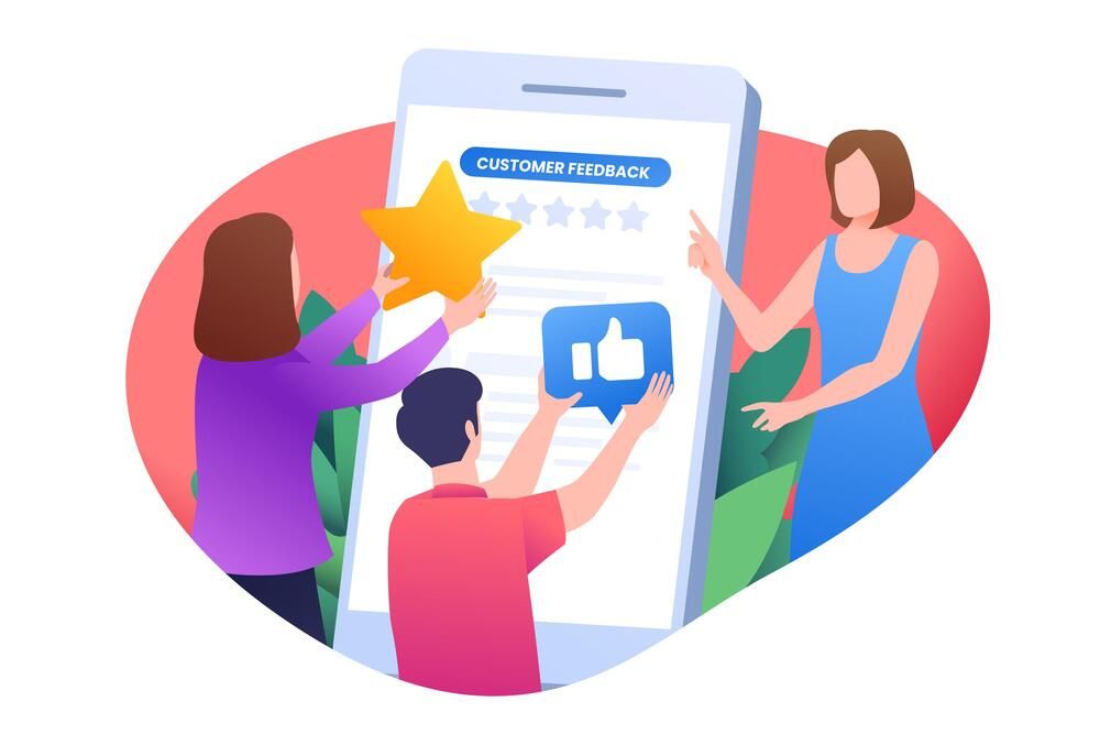
Welcome to the goldmine of e-commerce confidence – customer reviews and testimonials. Often overlooked but incredibly potent, these nuggets of social proof are the bread and butter of trust-building in the e-commerce universe.
Why Social Proof Is King:
Shoppers today are detectives seeking out proof that your product is as stellar as you say. Positive feedback? That’s akin to gold dust in enhancing shopper confidence. Reviews and testimonials shine as beacons of trust, guiding potential customers toward that coveted ‘Add to Cart’ button.
Tips for Showcasing Reviews:
- Strategic Placement: Nestle your reviews where they’re most impactful. For a powerful first impression, think of product pages near the shopping cart or splashed on your homepage.
- Highlight the Stars: Use bright colors and white space to make your star ratings stand out. A visual cue goes a long way in ecommerce web design.
- Real People, Real Stories: Photos of happy customers beside their testimonials make the review personal and believable. Remember, authenticity is key.
- Easy Navigation: Make finding reviews easy. If shoppers have to play detective to find them, you’ve lost the game. Embed them within product categories, visible even on mobile devices.
Incorporating reviews isn’t just about flaunting your best praise; it’s about showing prospects that you’re a credible, customer-approved choice. In a world where trust is currency, reviews are your best eCommerce design asset. So, leverage, highlight, and, most importantly, earn them. Making customer satisfaction a visible part of your eCommerce website design not only boosts confidence but also cements your reputation as a trusted place to shop.
10. Regularly Update Content
In the ever-evolving world of e-commerce, stale content is the enemy of sales. Regular content updates are your secret weapon, both for engaging your audience and giving your SEO rankings a hearty boost. Let’s explore how keeping your content fresh can transform your e-commerce website into a vibrant sales powerhouse.
Why Freshness Feeds Success:
- Boost Engagement: Updated content keeps your website dynamic and interesting, encouraging customers to come back for more. Think of it as continually restocking your virtual shelves with something new and exciting.
- SEO Love: Search engines adore fresh content. Regular updates signal that your site is alive, kicking, and relevant, helping to improve your rankings in search results.
Ideas to Keep Content Crisp:
- Blog Posts: Share insights, product news, or how-to guides. This not only showcases your expertise but also improves SEO with a steady stream of fresh content.
- New Product Releases: Regularly introduce new items or spotlight existing merchandise. This keeps your product pages vibrant and engaging.
- Customer Reviews and Stories: Continuously update your review section. New reviews contribute to fresh content and enhance social proof.
- Interactive Features: Consider a “What’s New” section or integrating a social media feed. This will add a dynamic element to your eCommerce design, making every visit unique.
Incorporating these practices into your e-commerce strategy ensures your site remains a go-to destination, not just a once-visited webpage. Remember, your e-commerce website design is like a living, breathing entity in the digital landscape. Nurture it with regular content updates, and it will grow in engagement, rankings, and, most importantly, sales. Keep it fresh and exciting, and watch your e-commerce store thrive.
In the bustling digital bazaar that is e-commerce, setting your online store apart hinges on more than just what you sell—it’s how you present it. Your e-commerce website design is a welcoming handshake, a friendly smile, and a knowledgeable guide that turns visitors into loyal customers. From crafting responsive, mobile-friendly experiences to designing clear, intuitive navigation, each element of your site tells a part of your brand’s story. High-quality product photos, engaging descriptions, and seamless checkout processes aren’t just details; they’re the cornerstone of successful online selling.
By integrating these critical design tips—from the first impression of bright colors and clean layouts to the reassurance of customer reviews and social proof—you lay the groundwork for a thriving eCommerce platform. Dive deep into these best practices, apply them with care, and watch as your e-commerce venture flourishes into a vibrant marketplace. The journey to e-commerce excellence starts with a single step—a leap into great design. Are you ready to transform browsers into buyers? Your stellar e-commerce website design is the key.
